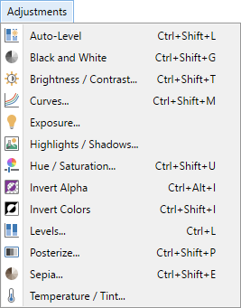
Adjustments Menu
The commands in the
Note
The examples on this page show the adjustments being applied to an entire image. It is easy to restrict the adjustment to a sub-section of the image simply by making a selection. If a selection is active when the adjustment is run, the effect will only be applied to the selected region.
Tip
The controls shown in the effect dialogs operate in much the same way; drag the slider left or right, type in a numeric value in the text box or use the up/down arrows beside the text box to change the current value.
The keyboard arrow keys can also be used to alter the value of a control once it has the focus.
Multiple controls can be used in isolation or combination. If more than one is altered, the cumulative effect will be shown.
 Auto-Level
The adjustment attempts to bring images which are under exposed or over exposed (overly dark or bright) back within normal range.
Tip
The
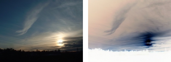
Example - Adjustments > Auto-Level
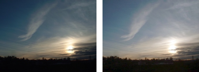
Before (left) and after applying Auto-Level (right).
 Black and White
This adjustment desaturates an image, removing all color information and rendering the image in grayscale. The resultant image will be reinterpreted in black, white & shades of gray.
Example - Adjustments > Black and White
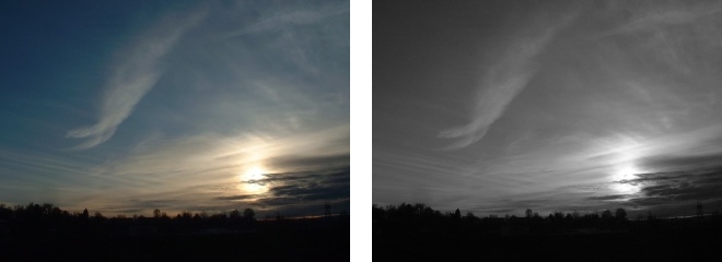
Before (left) and after desaturation with Black and White (right).
 Brightness / Contrast
This adjustment is used to make an image brighter or darker (Brightness), or to expand / contract the degree of difference between color tones (Contrast).
Brightness
To increase the overall brightness of an image, slide the
To decrease the overall brightness, slide the control to the left. The image will appear darker.
Example - Adjustments > Brightness / Contrast
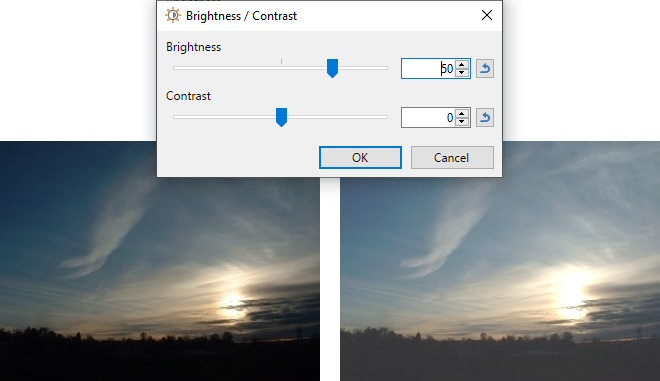
Increased brightness.
Contrast
Contrast determines the range of tones in an image. To make the color tones more similar, decrease the
To increase the
Example - Adjustments > Brightness / Contrast
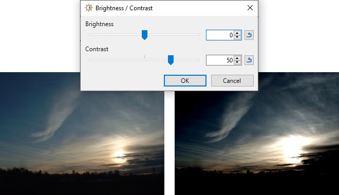
Increased contrast.
 Curves
The
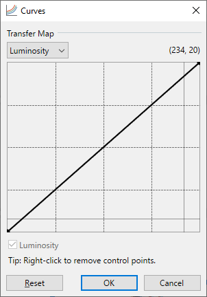
This powerful adjustment is covered in detail in the Curves section.
 Exposure
In photography, exposure is the amount of light which reaches the film or camera sensor. This adjustment increases or decreases the exposure of an image. The resultant image will have the apparent lighting increased (making the image lighter) or decreased (making it darker).
Example - Adjustments > Exposure
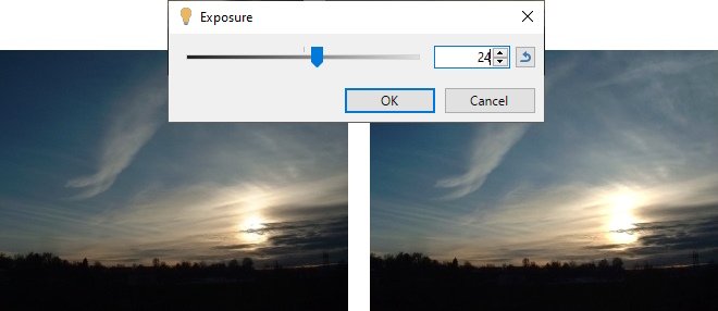
Before (left) and after increasing the exposure (right).
 Highlights / Shadows
Adjusts the highlights and shadows of the image.
Example - Adjustments > Highlights / Shadows
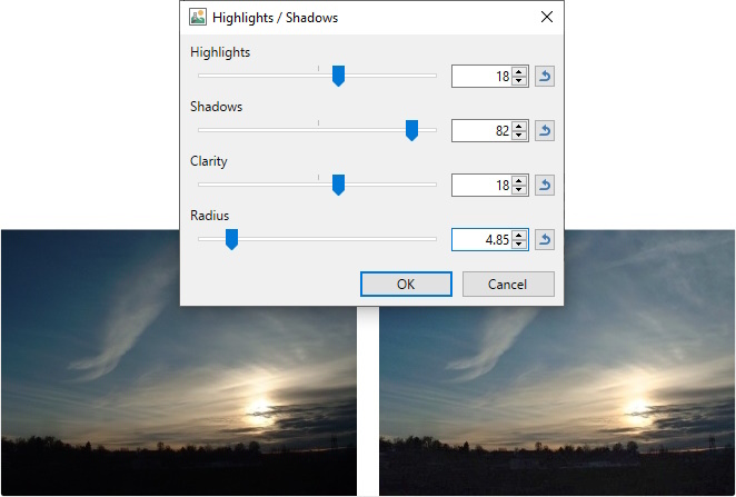
Before (left) and after (right). Notice the foreground buildings just starting to appear from the darkness.
 Hue / Saturation
This adjustment is primarily used to change the saturation, or vividness, of the colors in an image. The gamut of hues can also be rotated to render the image in a different palette while maintaining the same levels of contrast.
The adjustment also allows the modification of the images lightness, which is similar to the Brightness adjustment (see Adjustments > Brightness / Contrast above).
Hue
The Hue control rotates the colors used in the image. If you imagine the entire color range placed around the circumference of a circle, this control allows the current palette to be cycled around the circle. The differences between the palette colors will be retained.
Example - Adjustments > Hue / Saturation
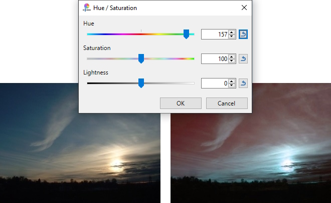
Before (left) and the modified image (right) showing Hue rotated to 157.
Saturation
This control makes color tones more or less vibrant. If you're familiar with the color wheel in paint.net's
The starting value of the
Example - Adjustments > Hue / Saturation
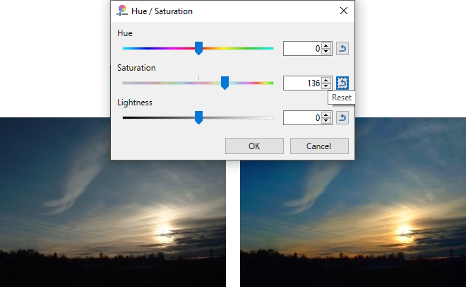
Before (left) and the modified image (right) showing Saturation increased to 136. The colors are more vibrant.
Lightness
Lightness acts in a similar way to the Brightness adjustment (see Adjustments > Brightness / Contrast above). Use the
The initial value of the
Example - Adjustments > Hue / Saturation
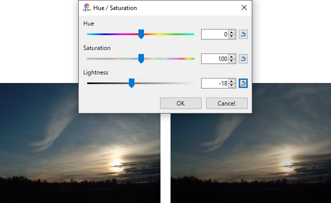
Before (left) and the modified image (right) showing the image being dimmed with a Lightness value of -18.
 Invert Alpha
This adjustment inverts the opacity value. Opaque areas become transparent and vice versa. Applying the adjustment a second time restores the original image.
Example - Adjustments > Invert Alpha

Before (left) and after Alpha inversion (right).
 Invert Colors
This adjustment is very similar to a photographic negative. Colors are swapped for the hue found on the opposite side of the color wheel. Black become White and vice versa for example. Applying the adjustment a second time restores the original image coloration.
Example - Adjustments > Invert Colors
Before (left) and after color inversion (right).
 Levels
This complex adjustment is used to adjust the color range and gamma index of an image.
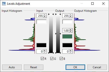
A detailed discussion of this adjustment can be found in the Levels section.
 Posterize
This adjustment reduces the number of color values that each pixel can use. The effect gives an image a "posterized" or even a retro or "faux dithered" look.
Normally, each of the RGB (Red, Green & Blue) color channels has 256 possible values (0 through 255). This adjustment limits the range from as few as 2 to a maximum of 64 possible values.
Example - Adjustments > Posterize
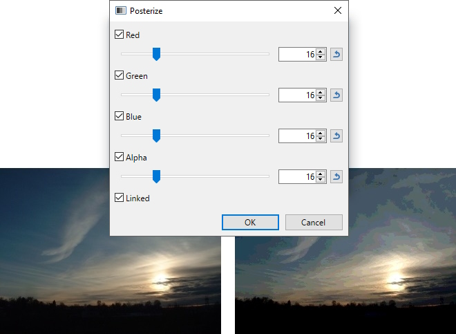
Reducing the range of colors with Posterize.
The RGB color channels can be manipulated independently if the ☐
 Sepia
Sepia
This adjustment mimics an aged photograph by rendering the image in black & white, and adding a sepia tone. This can be used to give images an "aged" look.
Example - Adjustments > Sepia
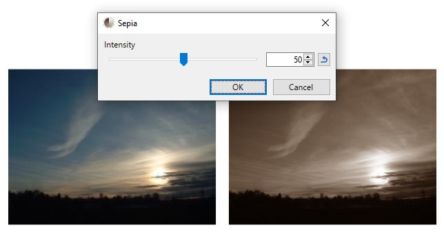
Before (left) and after applying the Sepia filter (right).
 Temperature and Tint
Adjusts the Color temperature and Tint of an image. Color Temperature is the relative warmth or coolness of light, affecting all the colors in the scene. Different lights result in different color temperatures; some light makes the colors cooler, while others make the scene look warmer.
Example - Adjustments > Temperature and Tint
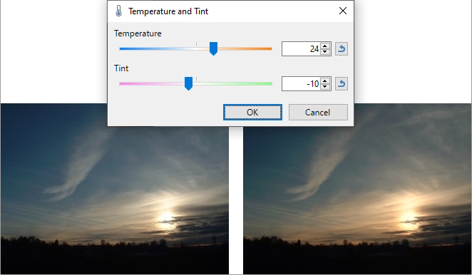
Before (left) and after increasing the 'warmth'of the image (right).